Delivra Rebrand
Rebranding a 10+ year-old company is no small feat. But we were excited to take on the challenge, especially for a down-to-earth, humble, and fun company like Delivra. We turned a strong internal culture into a strong brand identity, creating a consistent thread from support through to marketing.
Problem
As a brand within the CM Group portfolio, Delivra was due for a refresh, after both Campaign Monitor and Emma received their own rebrand.
Here are the goals we had in mind when developing the brand:
Portfolio separation: Delivra had to be distinguished from Campaign Monitor (Ruler brand) and Emma (Caregiver brand), as many of our prospects were confused on whether one was differentiated from another.
Unique identity: WIth a focus on acquiring B2B customers, Delivra needed to stand out amidst competitors like Marketo, Hubspot, and other marketing automation platforms that can sometimes be dry or stiff.
Culture fit: The new brand needed to lean into the culture created at Delivra’s Indianapolis office, which had strong employee retention and customer happiness.
Plan
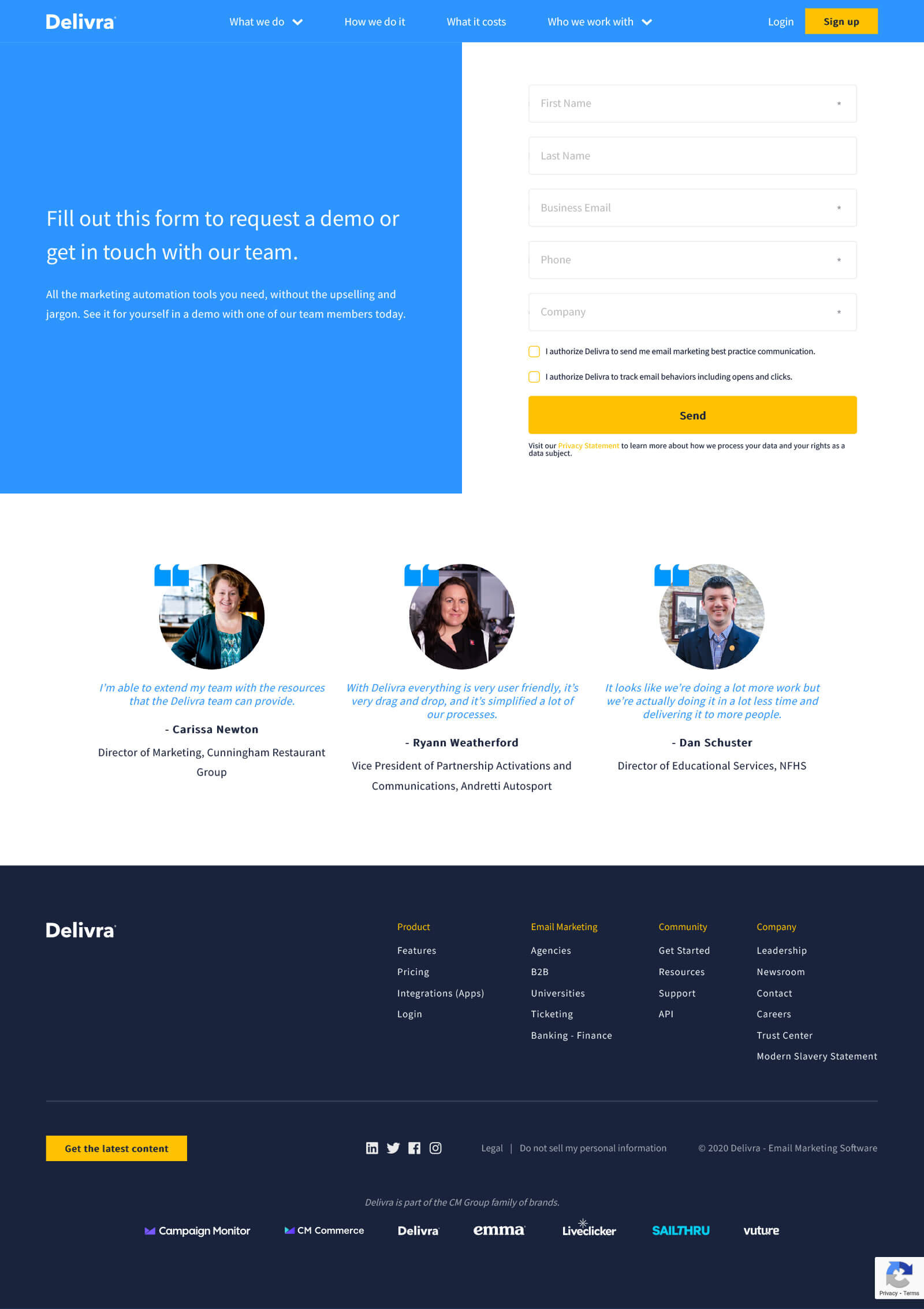
As a sprint team within the greater marketing group, we were given only about a week to work on the project before presenting the final brand guide. Once in Indy, we had 5 working days to present, decide on the new website pages and flow, wireframe page templates, and film 3 case studies with local customers.
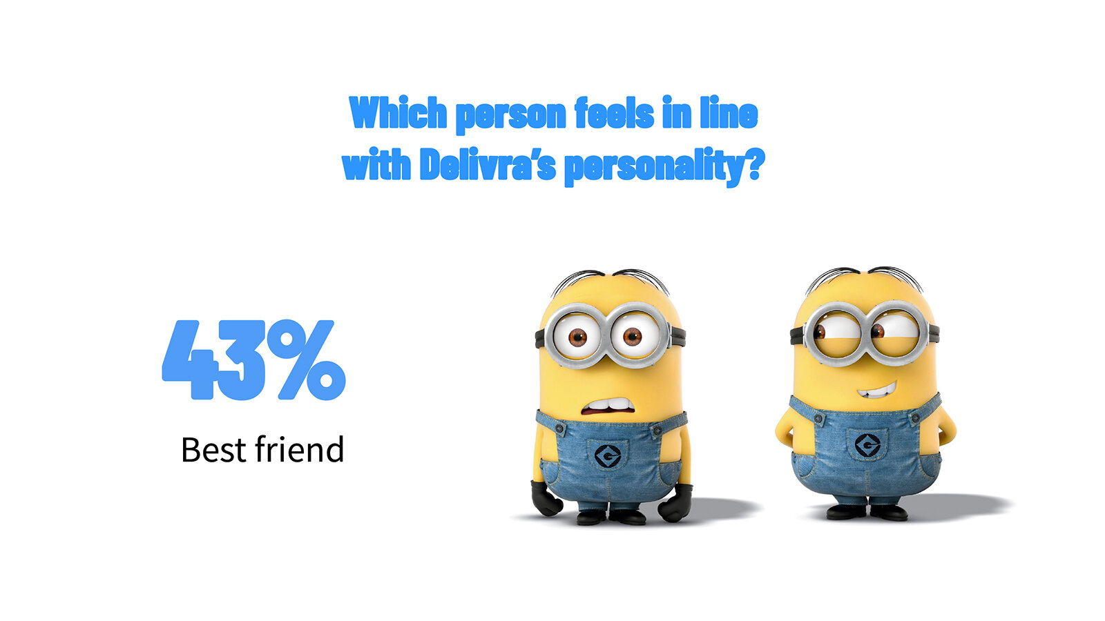
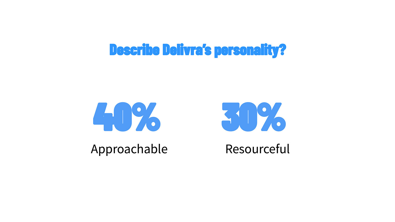
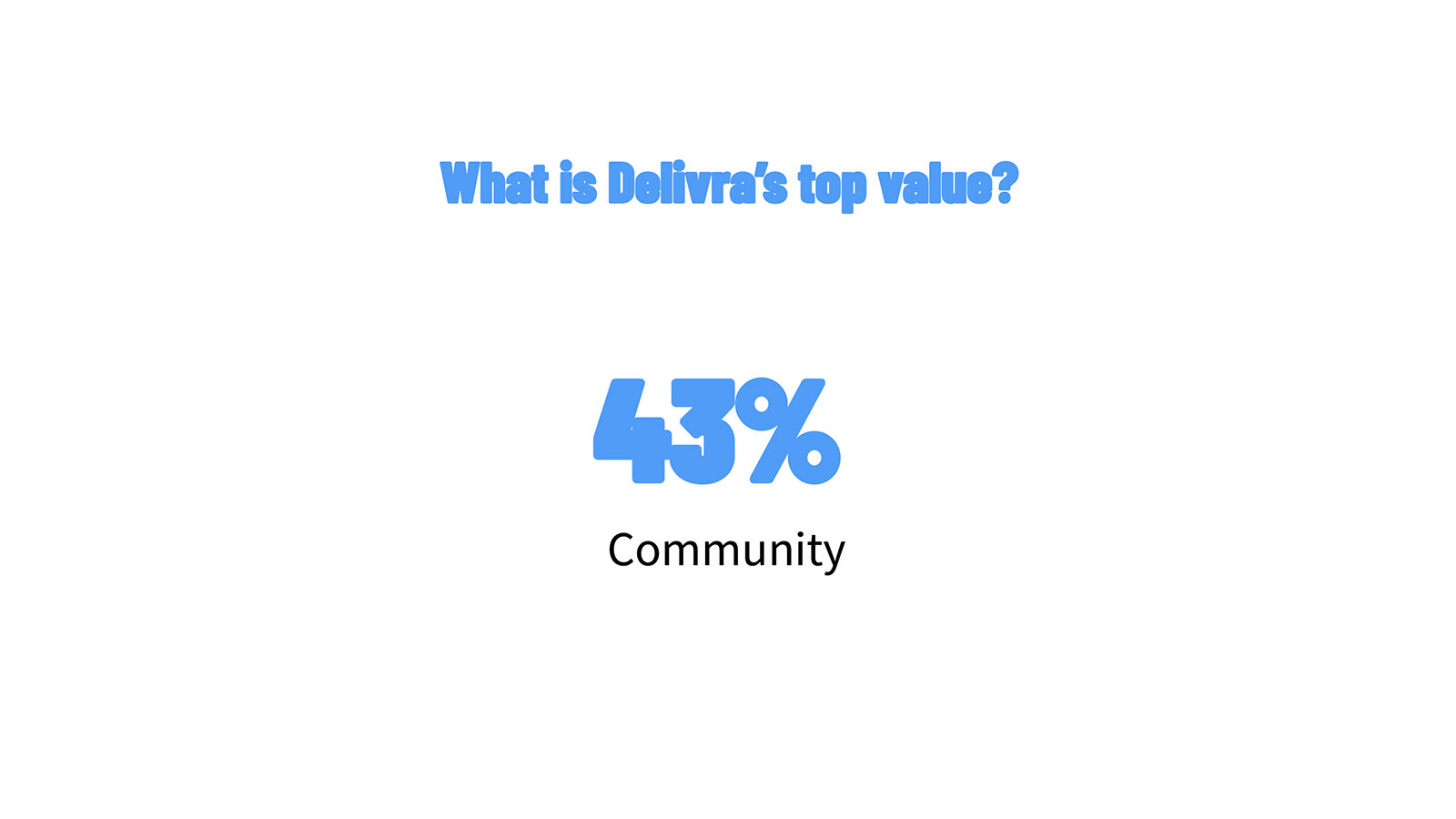
As one major piece of the process, we conducted a survey with the Indy team to hone in on a specific identity.
Brand survey
It’s important for all employees to really latch onto a brand identity if it’s going to succeed. You can find employee adoption through 1 of 2 means: creating a great idea they can get behind, or sourcing the identity from the existing employees. We opted for the latter approach, which was carried out by the survey.
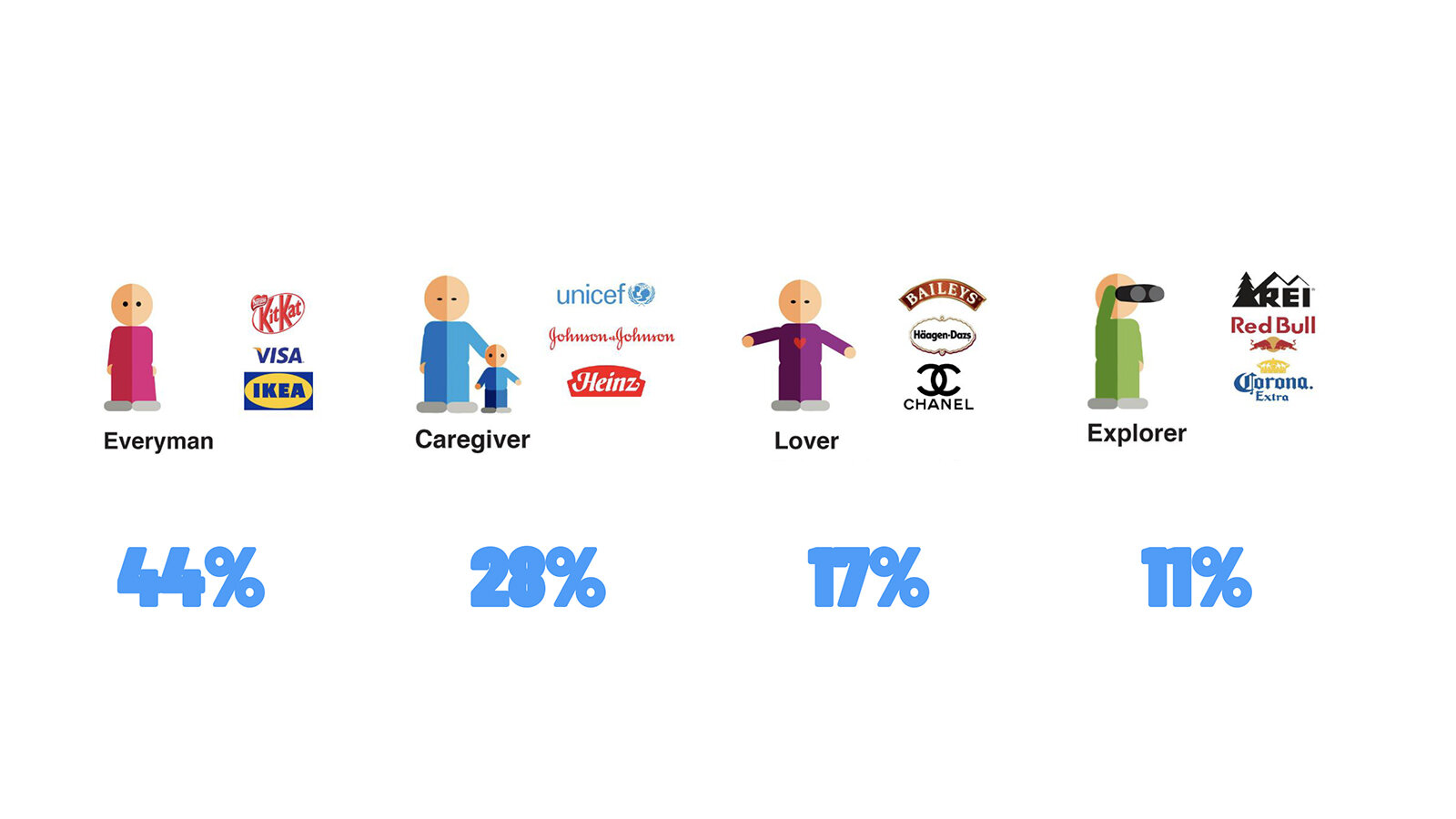
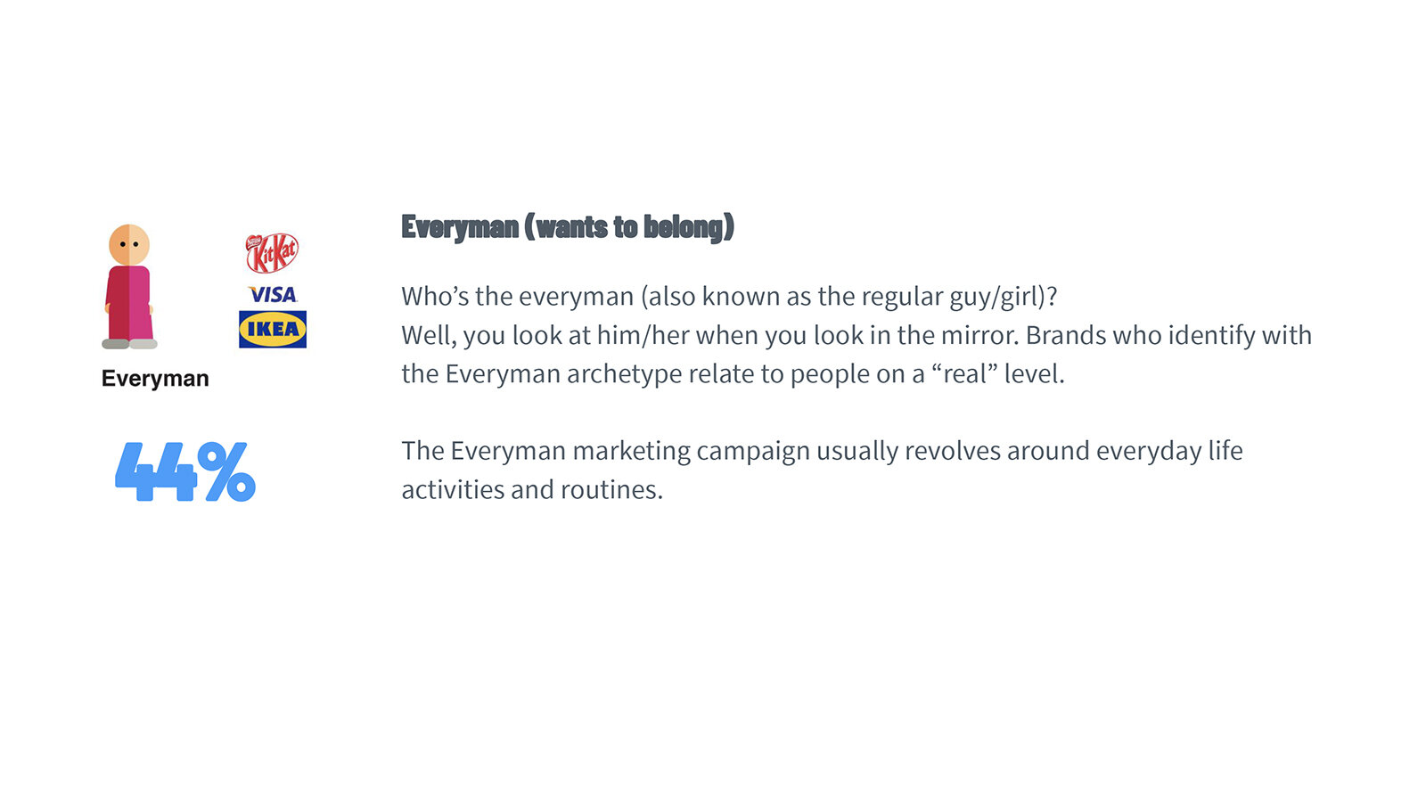
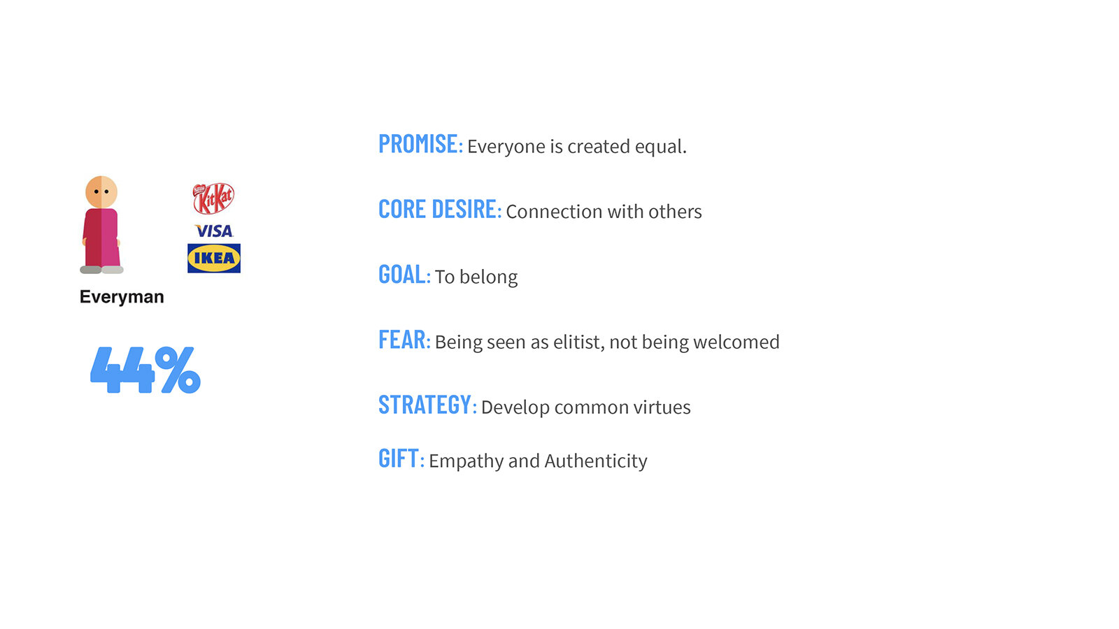
The brand survey asked a variety of questions that would hone in on the culture of the office and how they see themselves in relationship to others. We asked them to identify through sentiments, words, visuals, and characters. The survey results would then hone in on a specific brand archetype that would steer our decision.
For Delivra, we landed somewhere between the Lover and Everyman archetypes. Since Emma was already primarily positioned as a Caregiver brand, we focused on the Everyman.
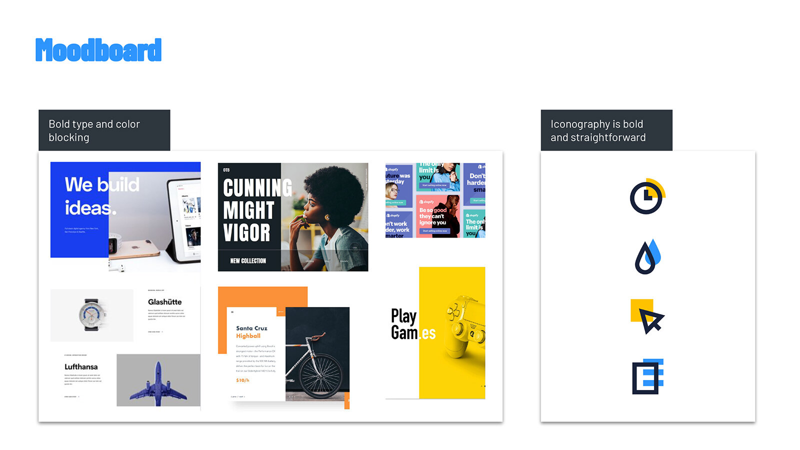
Mood board
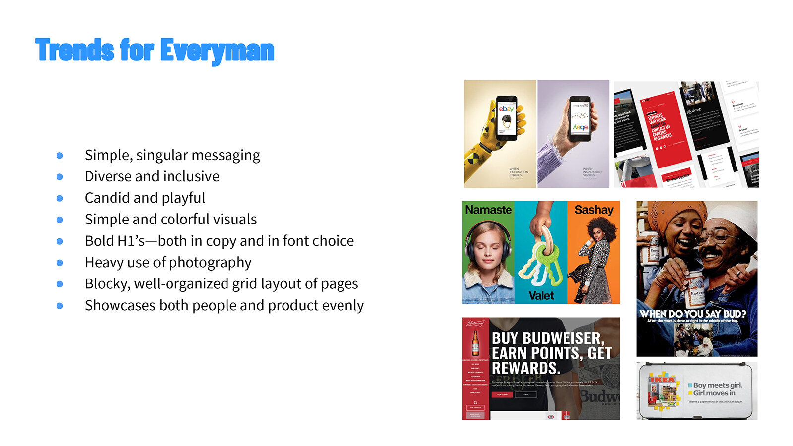
The next part of the plan was to create a mood board and gain inspiration from other Everyman brands.
We looked at brands like eBay and Ikea to see how some of the world’s most popular Everyman brands identified themselves in visuals and tone.
Execution
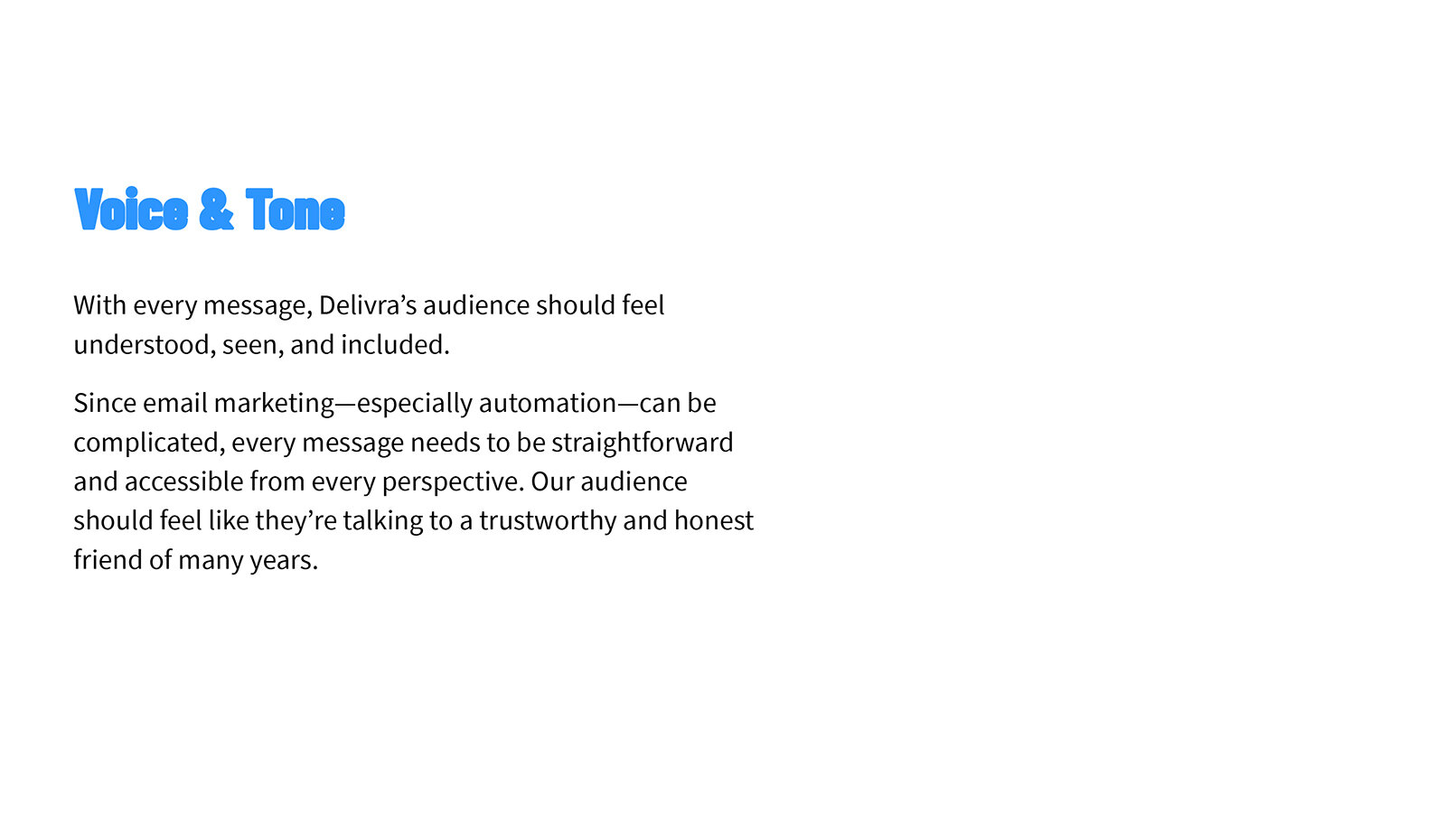
I executed on the voice and tone portion of the brand guide. It was important not only to examine ways an Everyman brand could be exhibited, but also unique identifiers to Delivra as a supplier for B2B companies, as well as a brand within a portfolio.
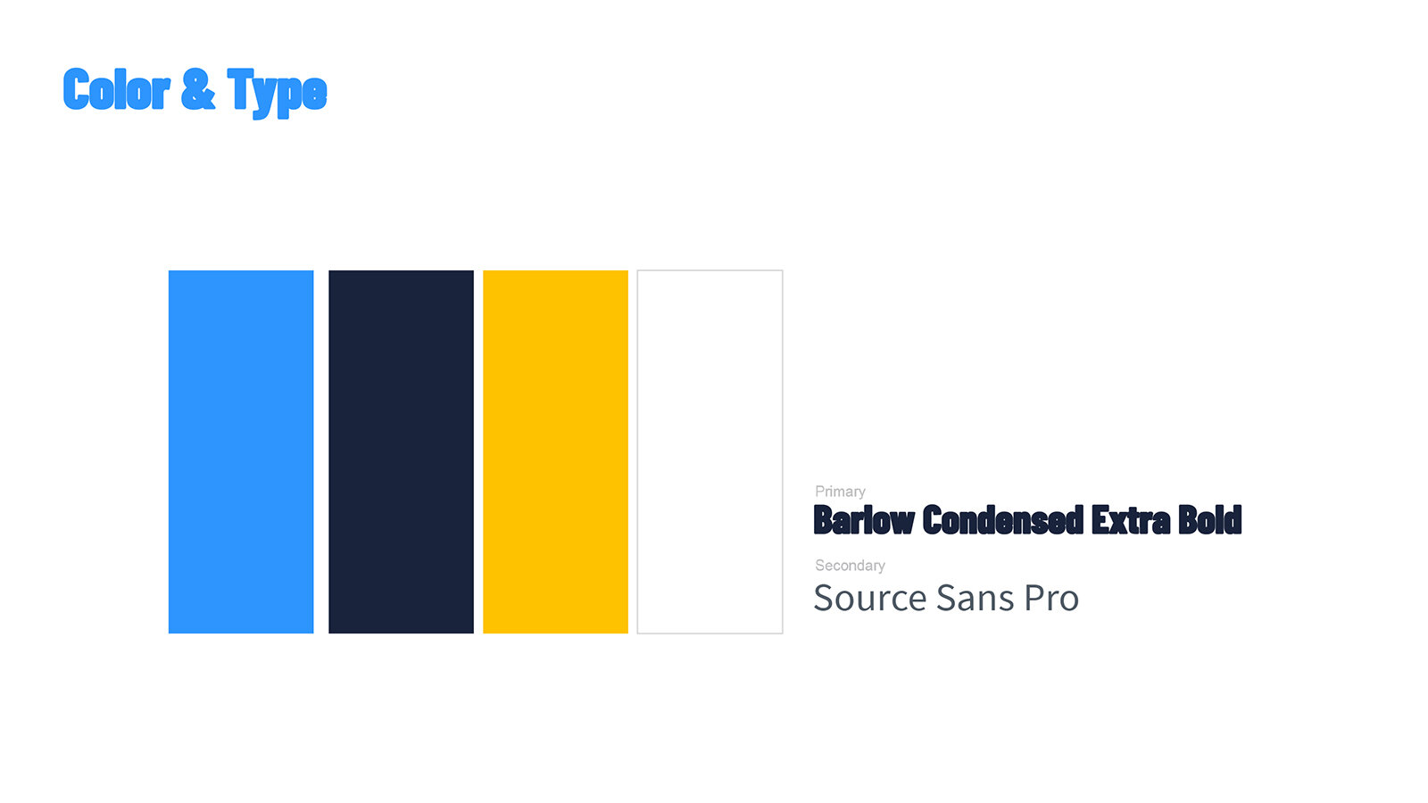
Brand guide
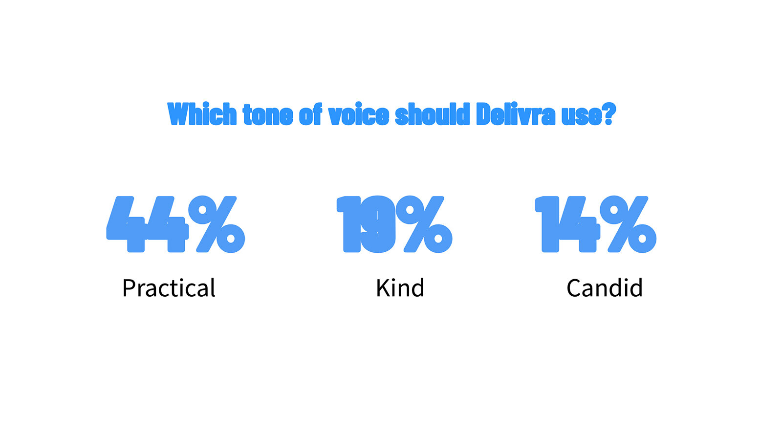
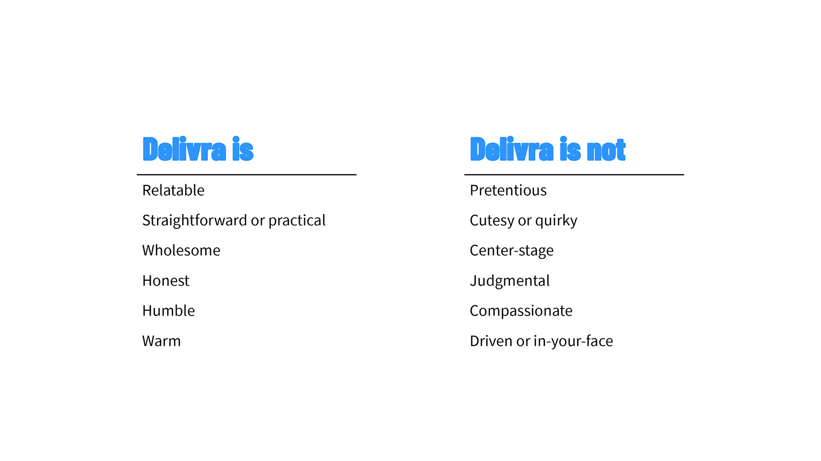
I really wanted to make sure that the voice could be carried out in all communications and materials. By leaning into the straightforward, no-bullshit approach, I outlined a voice and tone guide that would be easy to replicate.
One piece to notice under “Delivra is not:” is the use of “compassionate.” As stated in the goals, we wanted to make sure Delivra stood out from Emma, its sister brand. To stand out from the Caregiver brand of Emma, we needed to draw a specific line where the two would not overlap. So while Delivra’s tone was to be understanding and friendly, it was not to be gushing.
Here’s the finished brand guide.
Note: After exporting, some of the fonts have been obscured.


Website
During the brand team’s stay in Indy, we wireframed the core pages of the site and outlined a basic flow. When I returned to Nashville, I spent 5 days writing copy for the entire site: home pages, features pages, solutions pages, and integration pages.
I really tried to focus on distilling industry jargon and complex terms (e.g. automation, lead scoring) into approachable and understandable phrases.
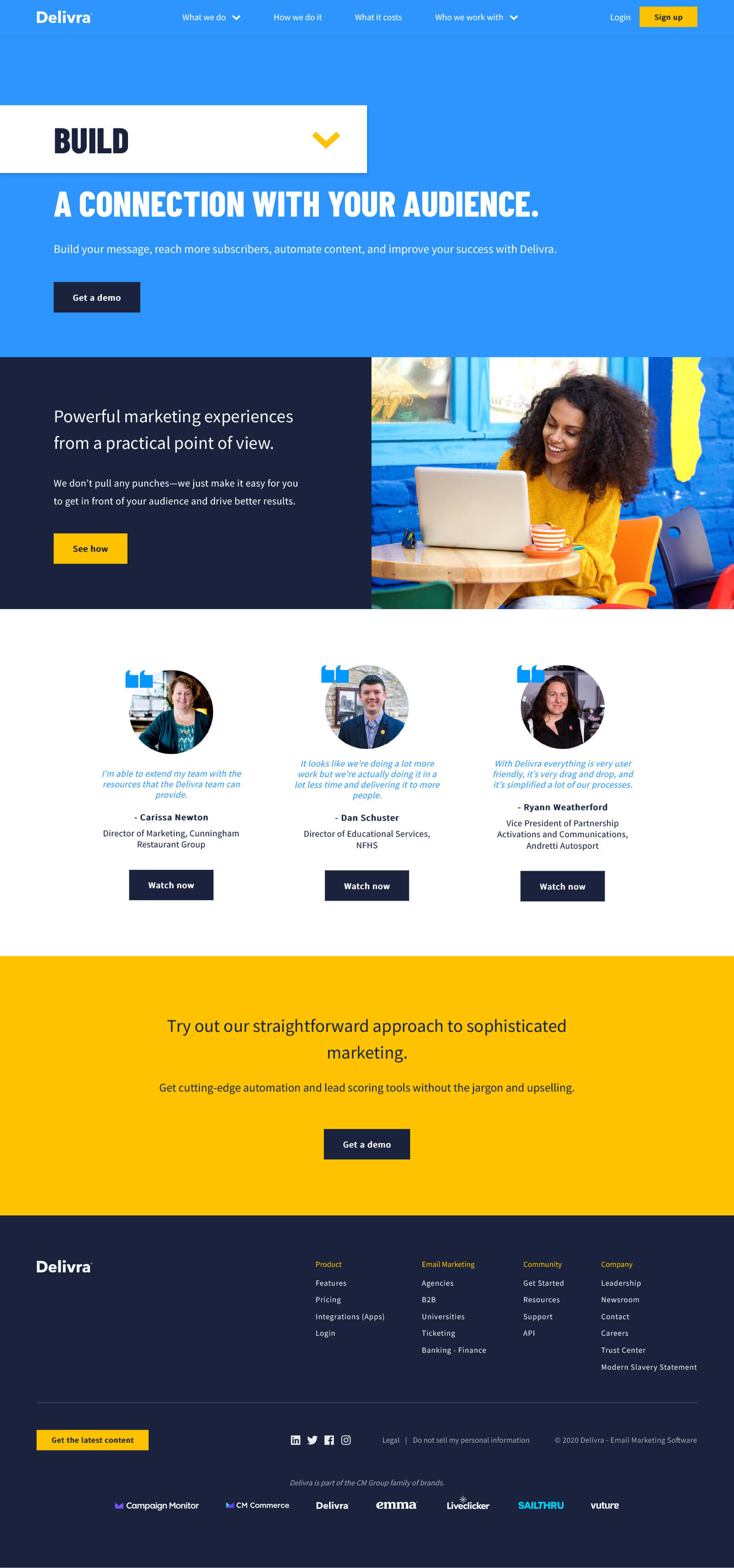
I led the team in the decision to try new primary nav conventions, which led to “What we do” for features, “How we do it” for resources, and “What it costs” for pricing. Again, attempting to eliminate jargon, we decided this approach was suitable to the Everyman brand.
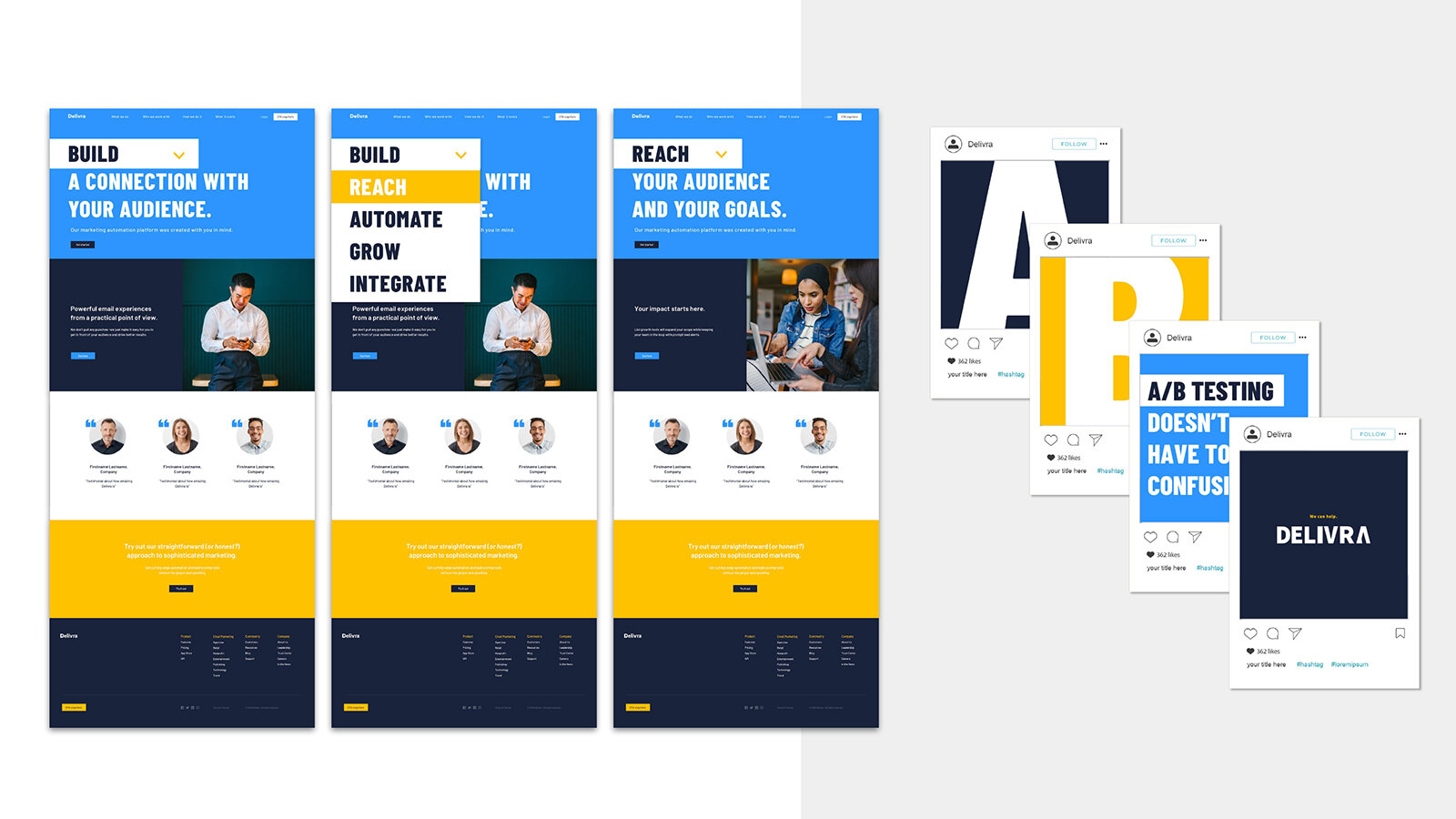
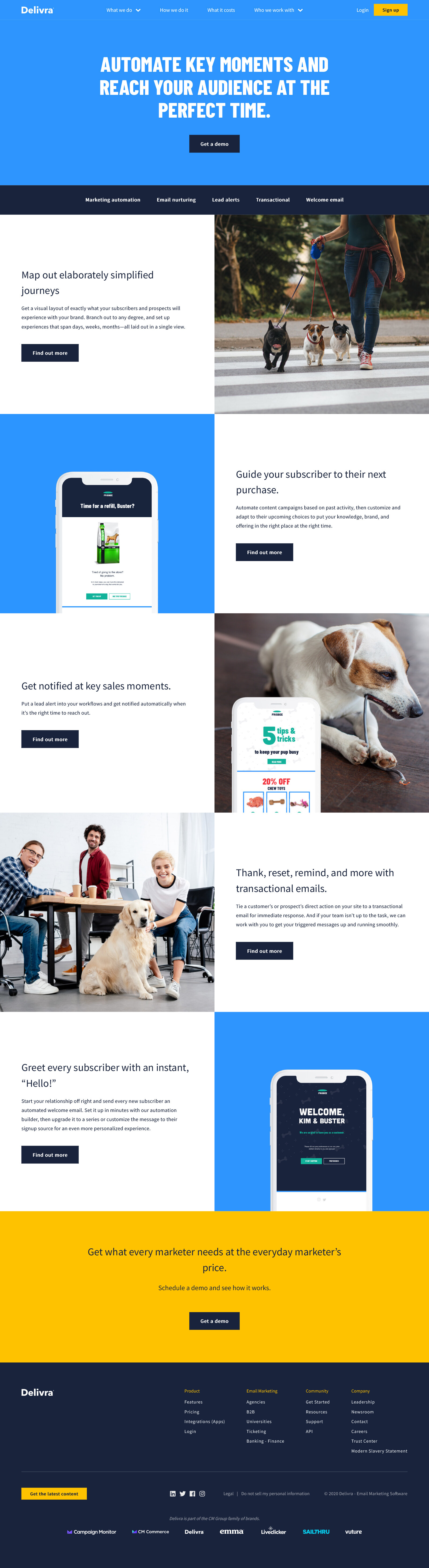
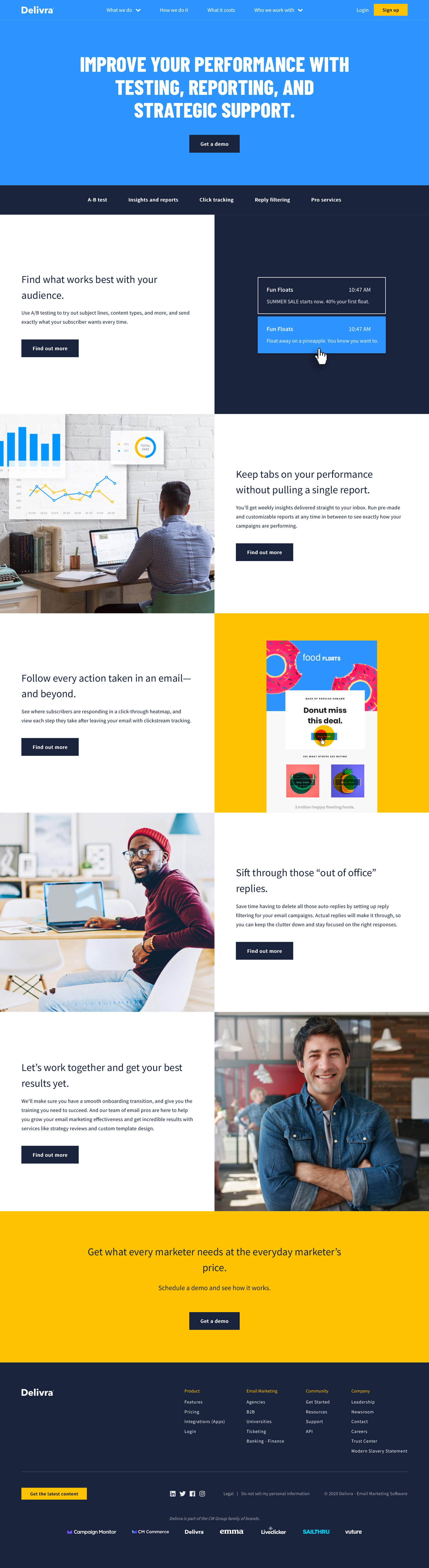
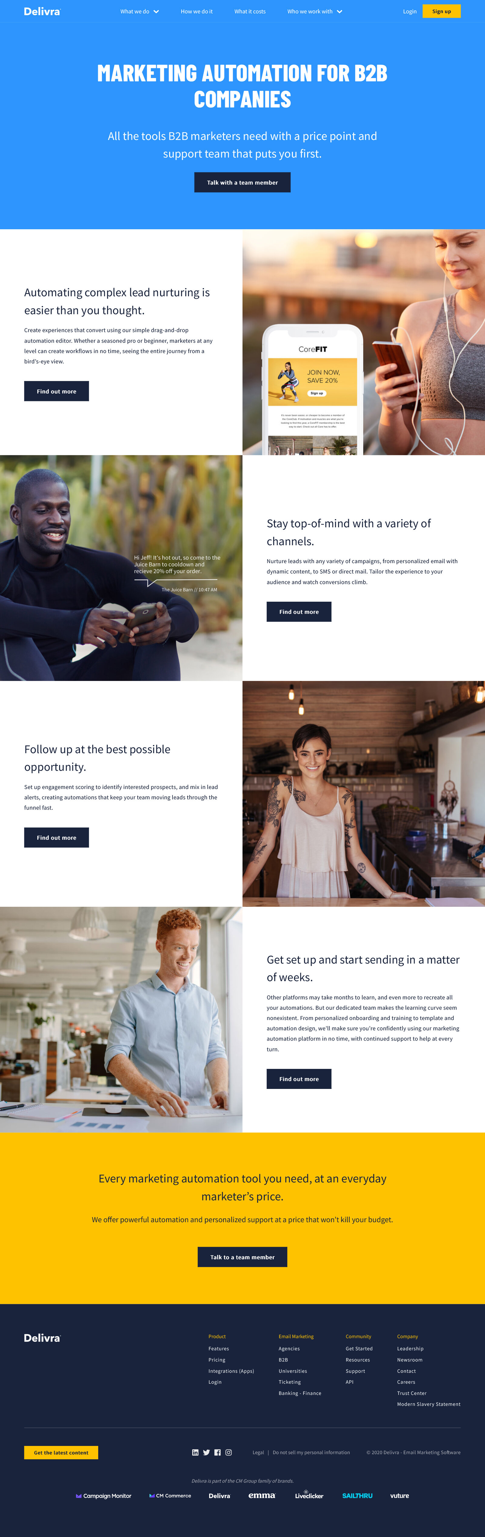
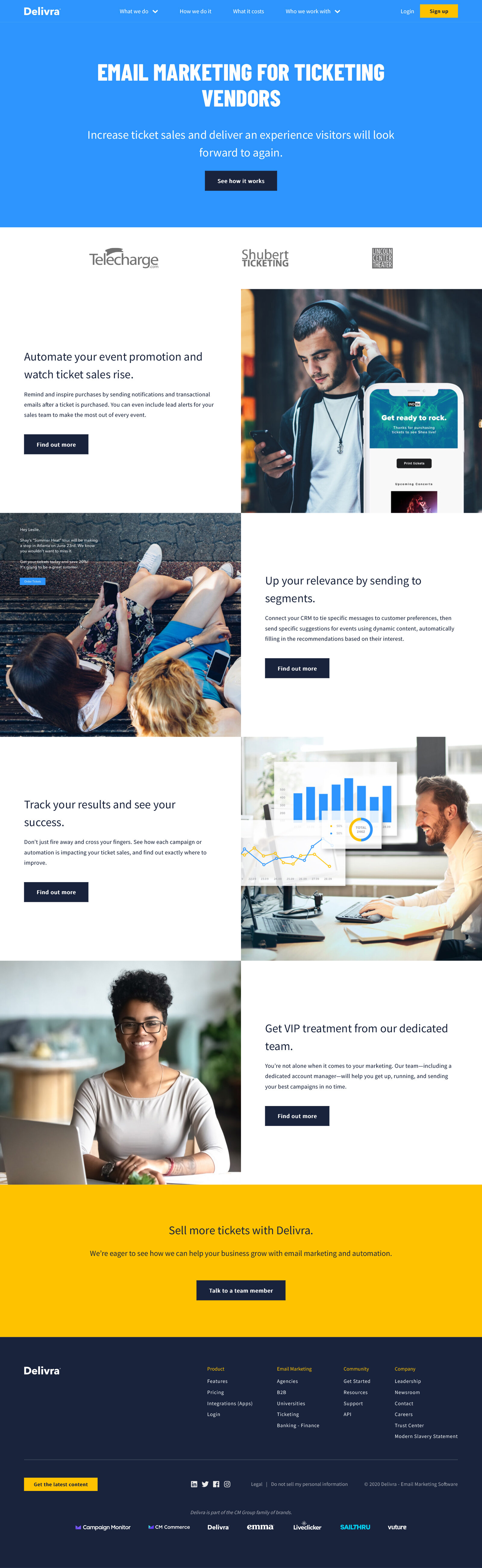
Homepage
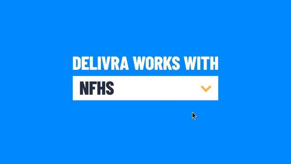
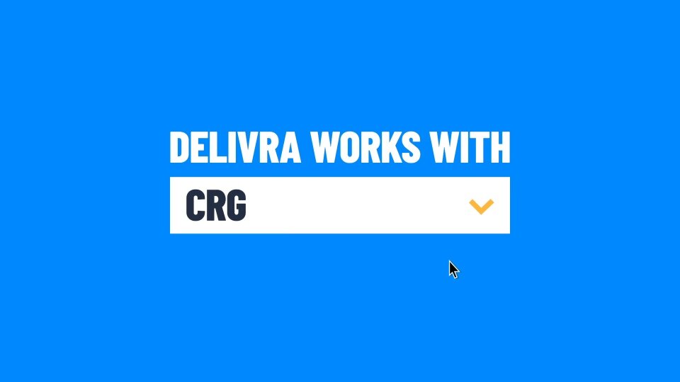
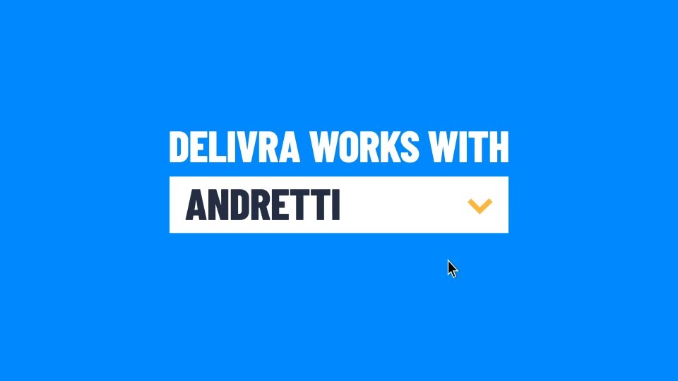
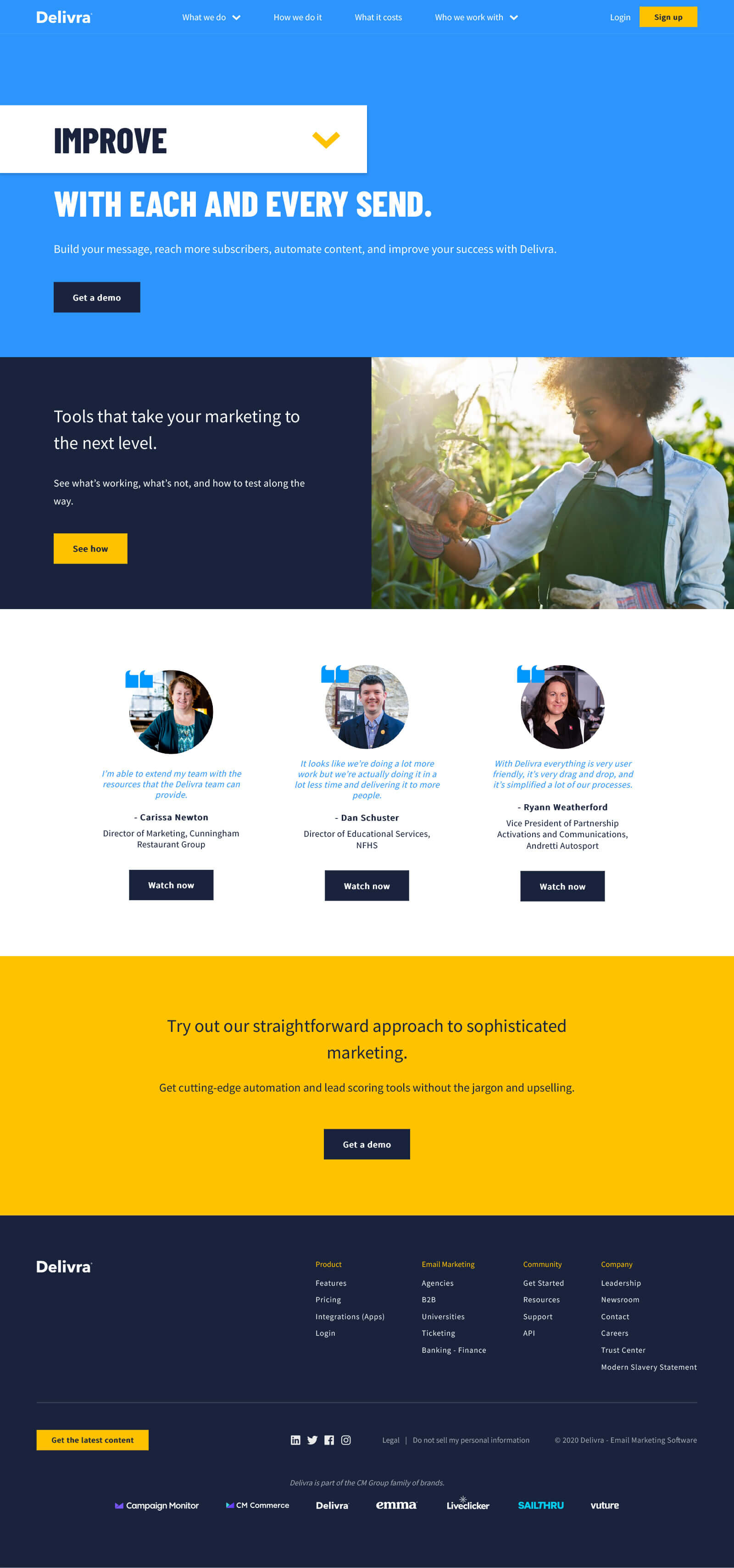
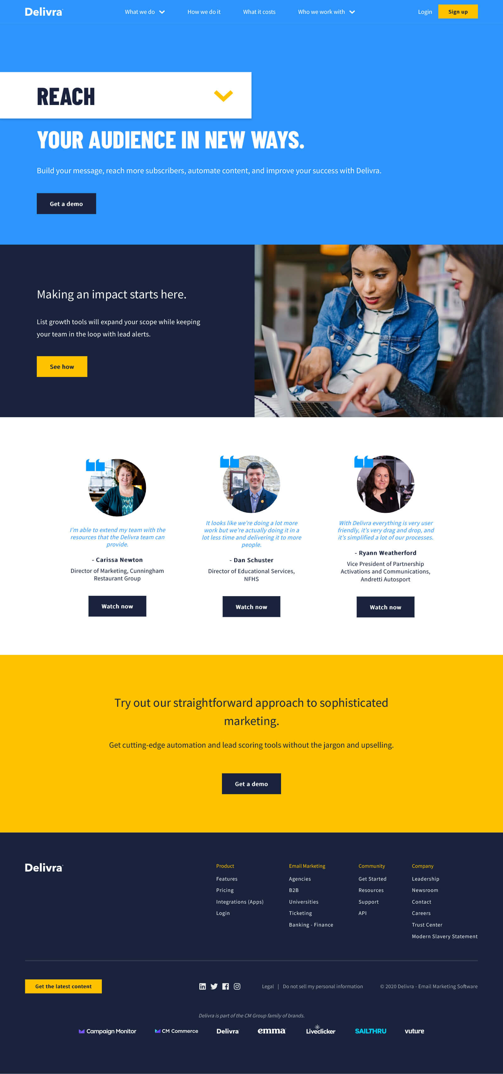
The design team had an exciting idea to have the homepage change based on the first dropdown section, so I wrote four different versions of the homepage to show dynamically. The goal here was to track users’ movements, so we could measure to see what they were most interested in. This method also gave a user more time on the homepage, getting more info before bouncing to another page.
Features pages
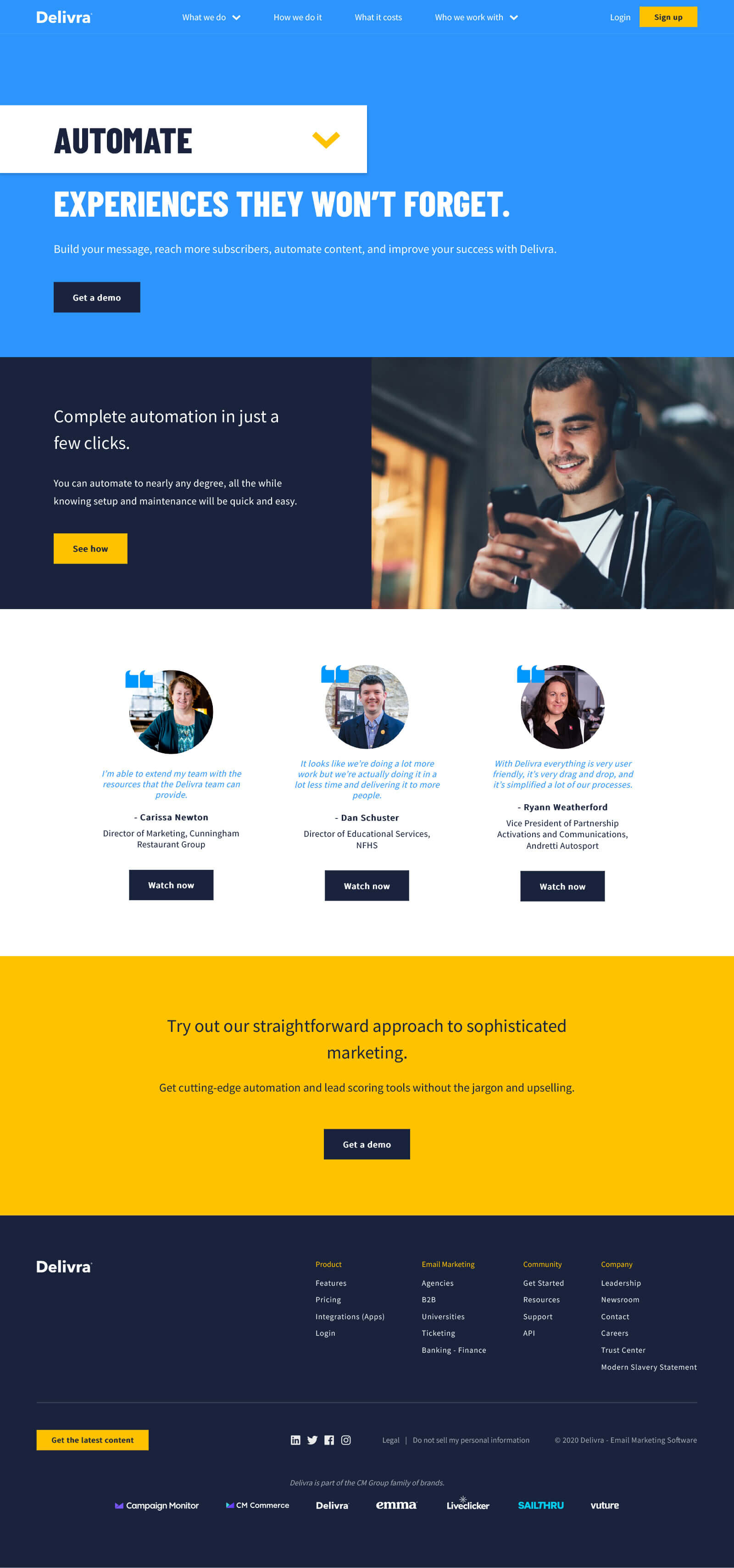
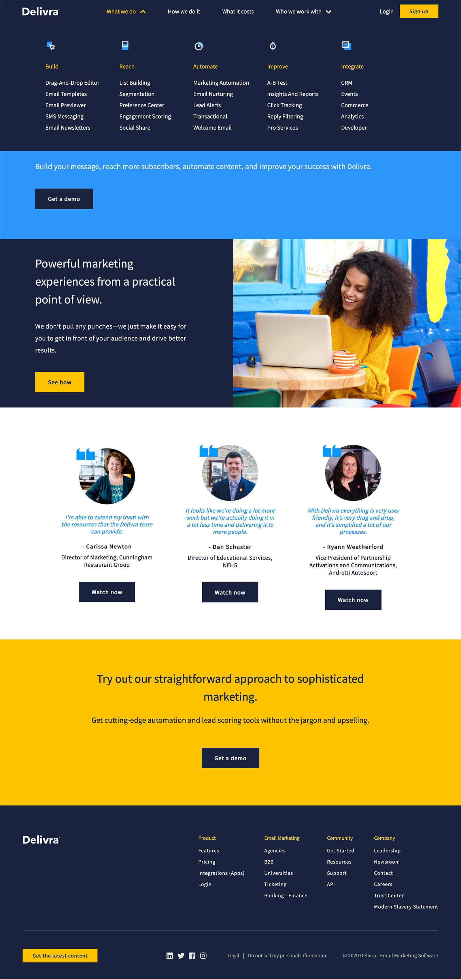
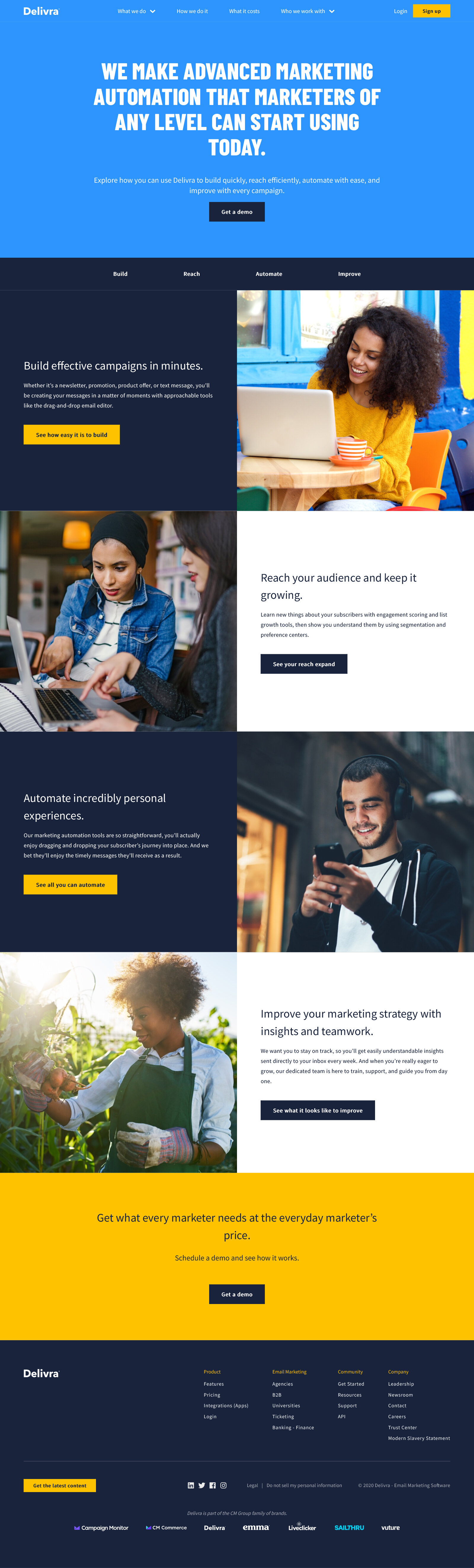
The former features pages were very elaborate. Each feature had its own page, which meant too many pages. So we streamlined the Feature Overview page, and categorized core features into 5 groups: build, reach, automate, improve, and integrate.
In terms of the Everyman brand, I decided to keep the main nav centered around simple actions. By making the nav organization as simple as it is, it builds brand trust in Delivra being straightforward and uncomplicated.

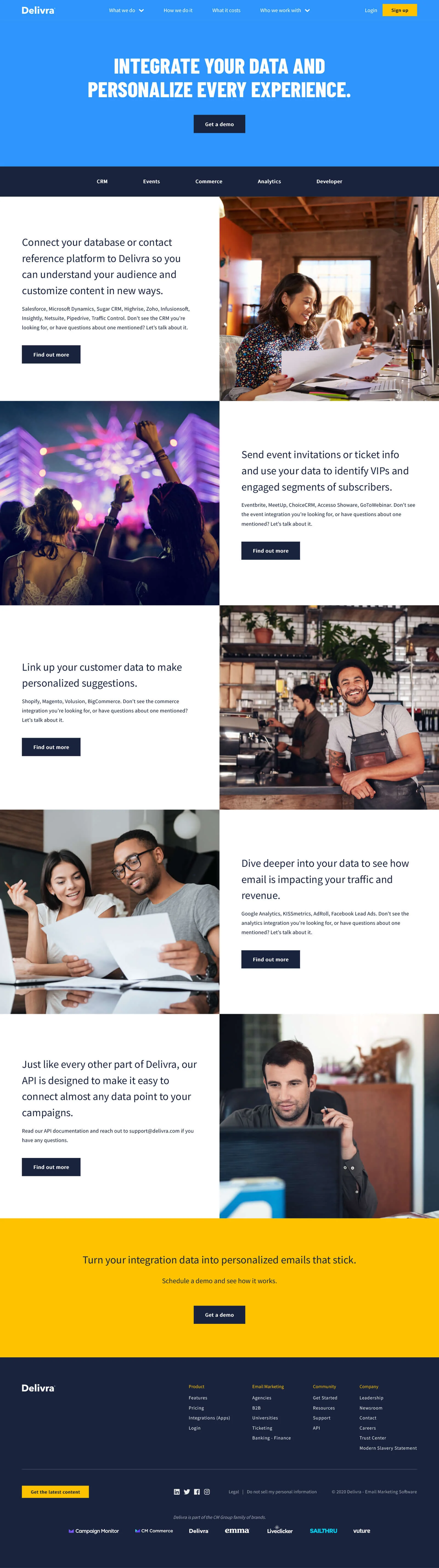
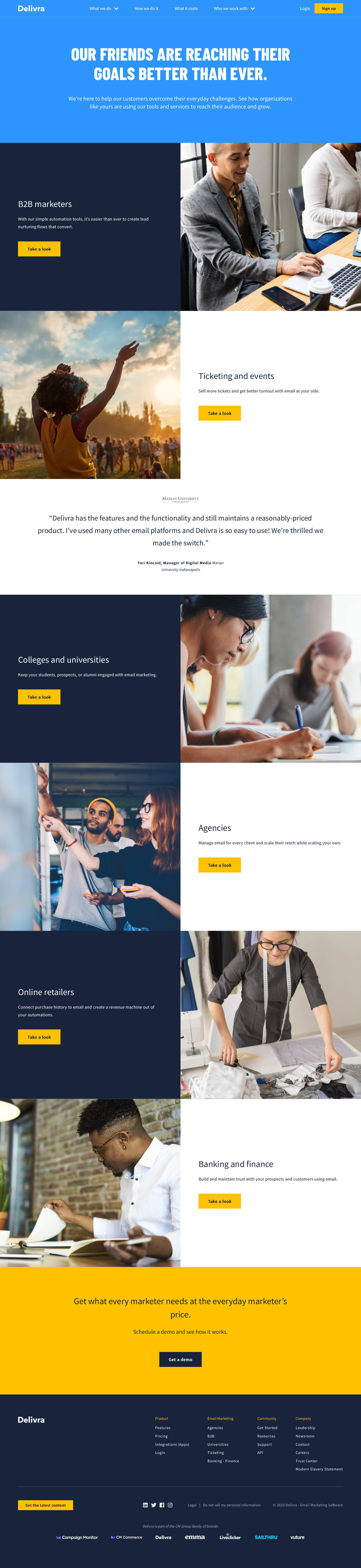
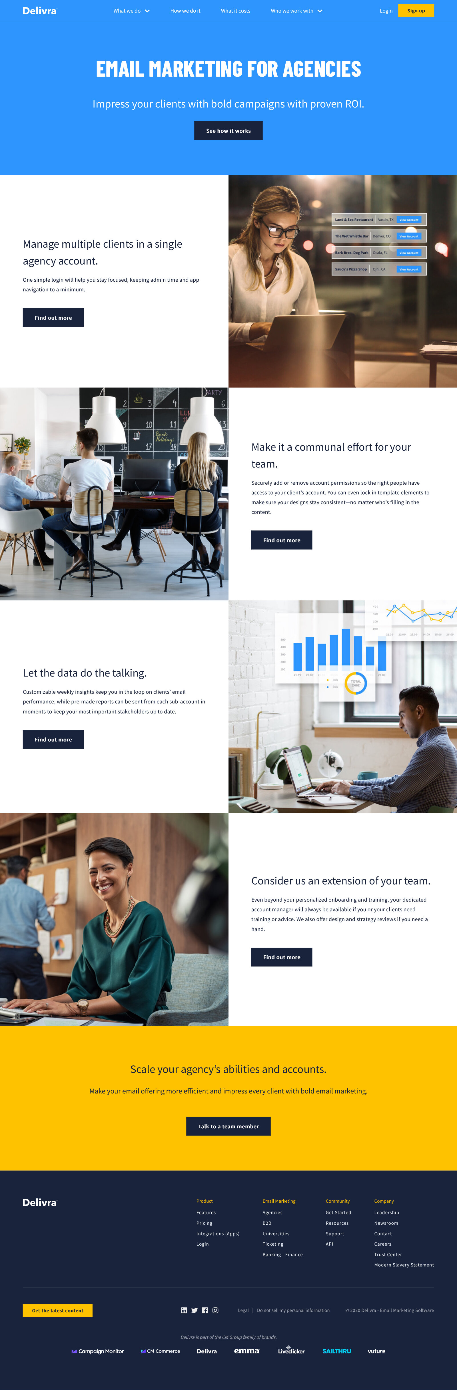
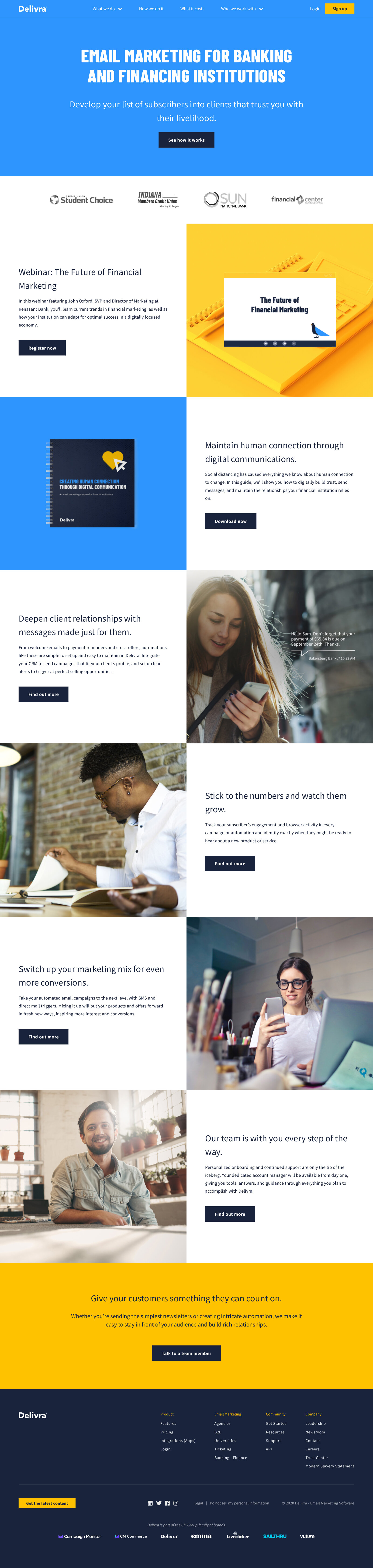
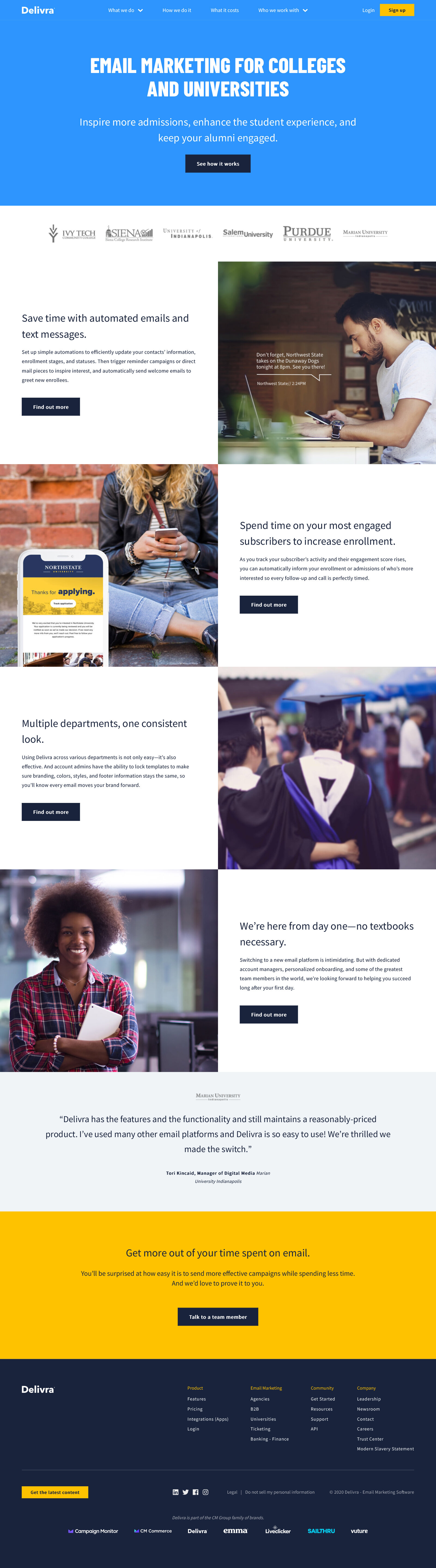
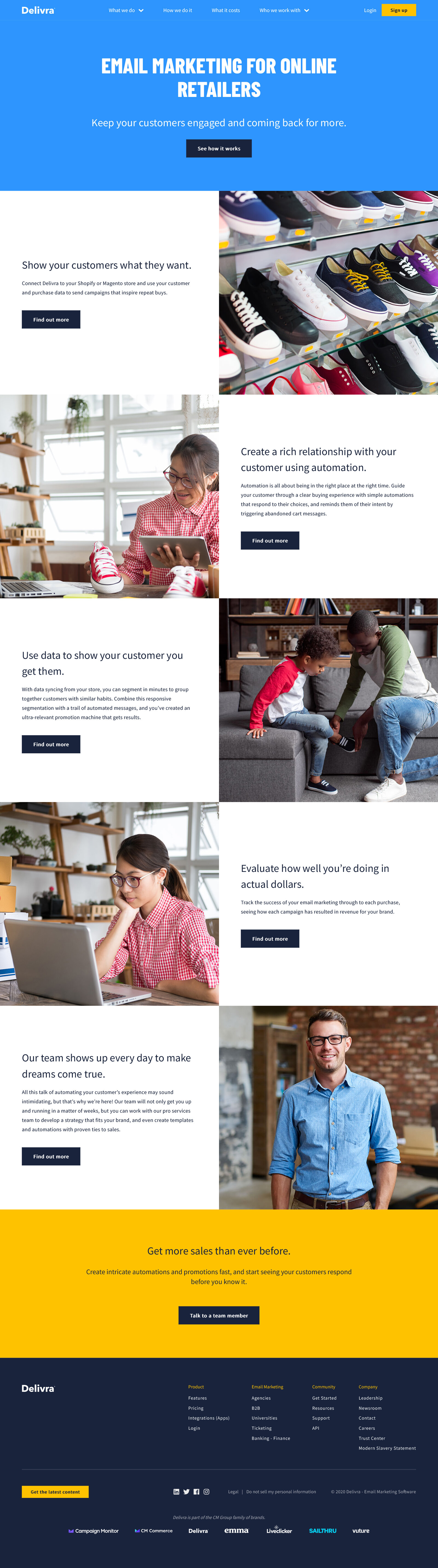
Industries
In SaaS, pointing out industry solutions is key to meet various prospect personas. I rewrote the existing industry pages to incorporate the new voice and tone messaging.
Case studies
During the brand team’s trip to Indianapolis, we met with 3 customers to film case studies. Without a pre-production meeting, we had to work very quickly to create rapport with the interview subject, capture b-roll, and record everything efficiently and professionally.