Feature Page Buildout
Feature detail pages are an important part of any SaaS product. These pages provide a deeper dive into specific features and product information, both offering insight into how the product works as well as some search engine opportunity for prospects looking for particular features.
Challenge
During my first stint at Kindful, I created a website structure that allowed users to go as shallow or deep as they’d like. That website structure was still somewhat in effect when I returned. It looked like this:
Image of Kindful’s sitemap
The 20+ feature pages had been drafted during my first run, but had since been adjusted and were in need of updates to accompany changes to the platform. For many of these pages, I needed to address poorly positioned copy, outdated information, and especially a lack of value-focused product images.
Process
Taking on overhauling the content for these pages was a daunting task. Not only did it require positioning forethought, but revisiting copy and creating new imagery.
I followed this process to update the pages:
Take inventory of all pages.
Prioritize by needs of the business.
Align positioning with current strategy.
Create visuals that communicated the feature’s value.
Inventory
The first step was to take inventory of the pages available. I got a list in Wordpress and had my SEO manager audit for ranking and recommend improvements to keyword focus based on search volume.
This inventory process also helped us identify which pages were too thin to be on their own, and highlight which needed beefing up as they existed at that time.
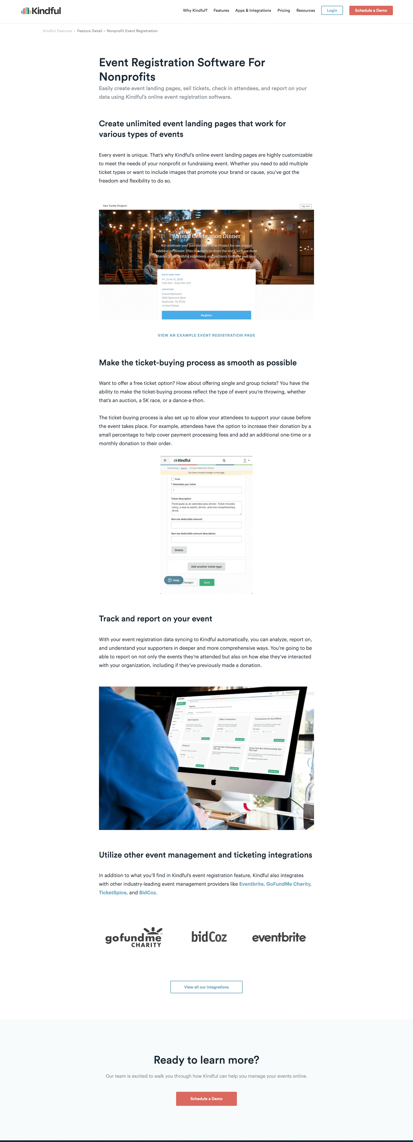
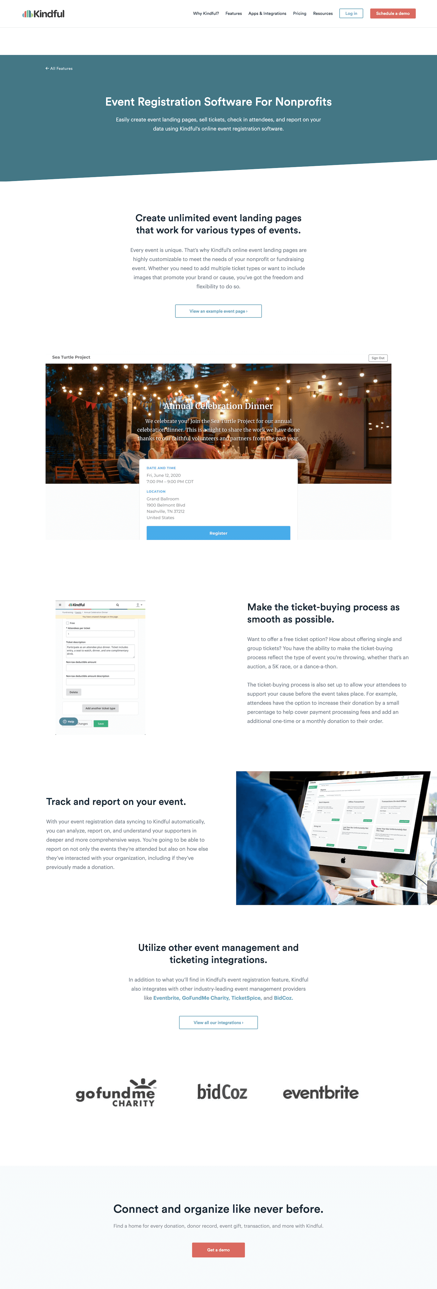
In the first stage of this process, I also looked at the content each page contained and required so I could implement a new template. I pitched a new wireframe and template to our website developer so that the pages could be a bit more dynamic. You can see the changes here:
The original template was a single-column, blog-style approach, where all content followed in a sequential order. This was a great starting point, but made for a longer page that didn’t offer the best skimming capabilities.
I had our developer create a Wordpress template that had the following components:
Adjustable hero: The hero background could be chosen from any of our brand colors, or using an image.
50/50 column layout: Each content section can be placed as a 50/50 (image on one side, copy on the opposite), and a script was written to automatically alternate positioning while always stacking image on top of copy for mobile.
Center layout: Each content section also had an option to center the copy, if there was a major point to call out or th need to break up monotonous columns.
CTA option: Whether 50/50 or center, the module also had an option to add a link, which generated a button CTA.
Prioritize
Next was to prioritize which pages should be worked on. Typically I would be going through all copy first and then passing to design. In this situation, since there were so many pages to work on and most of them were in need of help, I went through two filters to rank priories:
Which keywords got the most search volume?
Which features were leveraged by the sales team?
These two paths to determine priority would tie any work done to instant results.
Align
The first step here was to create new messaging and learn from it. When kicking off this project, I had also just launched a project to test a new homepage, so I needed to learn from that as fast as possible and implement on this product-focused pages.
The other piece of this was to align visuals with how the brand was positioned. This utilized imagery from said homepage test to tie in connectivity and humanity.
Part of this process also includes market research. For some topics, it was important for me to understand how people in the nonprofit world are thinking about these tasks and operations around Kindful’s features. So I’d do a bit of preliminary research to understand their needs and how they could potentially use a feature to fit their situations.
Create
I started off planning on only writing copy, and requesting image assets from our contract product designer. However, after discussing, it made more sense to deliver original Figma drawings over to me so that I could craft a story out of the product shots. So I quickly learned Figma and started designing product images.
Per the alignment, the copy needed to position the platform as a connector—connecting donation, donor, and integration data in an unseen and unfelt fashion. The images therefore also needed to incorporate this positioning, and I needed to showcase how a single donor could show up across the Kindful system, giving users a better understanding of how it all connects and integrates.
Product
During a few months at Kindful, I wrote, designed, and implemented the following pages.
PRODUCT MARKETING
Product image narrative design
For any SaaS product I’ve worked on, it’s always a struggle to get product images that display in high fidelity, look clean, and showcase authentic data and use cases.
It’s vital that examples look authentic—prospective customers need to imagine themselves using the product, and displaying an instance that would look similar to their own makes that possible. There’s also an aspect of creating a narrative that showcases growth and the transformative state that customers are dreaming of when they consider using the product.
At Kindful, I worked with the product designer to access original screens built out in Figma. Once I had access, I looked at live customer data as a reference, and built out the examples to look similar. Then I adjusted each image to show the best information for the context.
My responsibilities:
Design and adjust product screens in Figma.
Consult customer data and reflect product screens to look authentic.
Craft campaign names and organization details that are similar to ideal customer personas.
Format screens to show isolate certain aspects based on the context.
Feature page
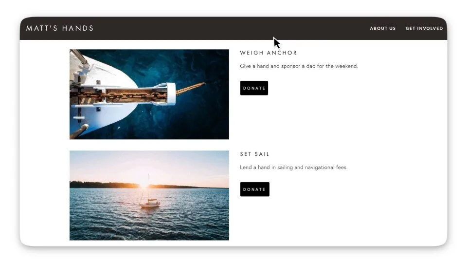
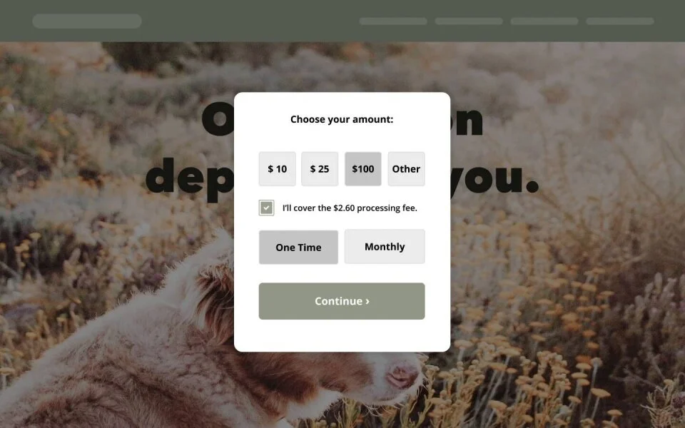
Donation Button and Pop-up Forms
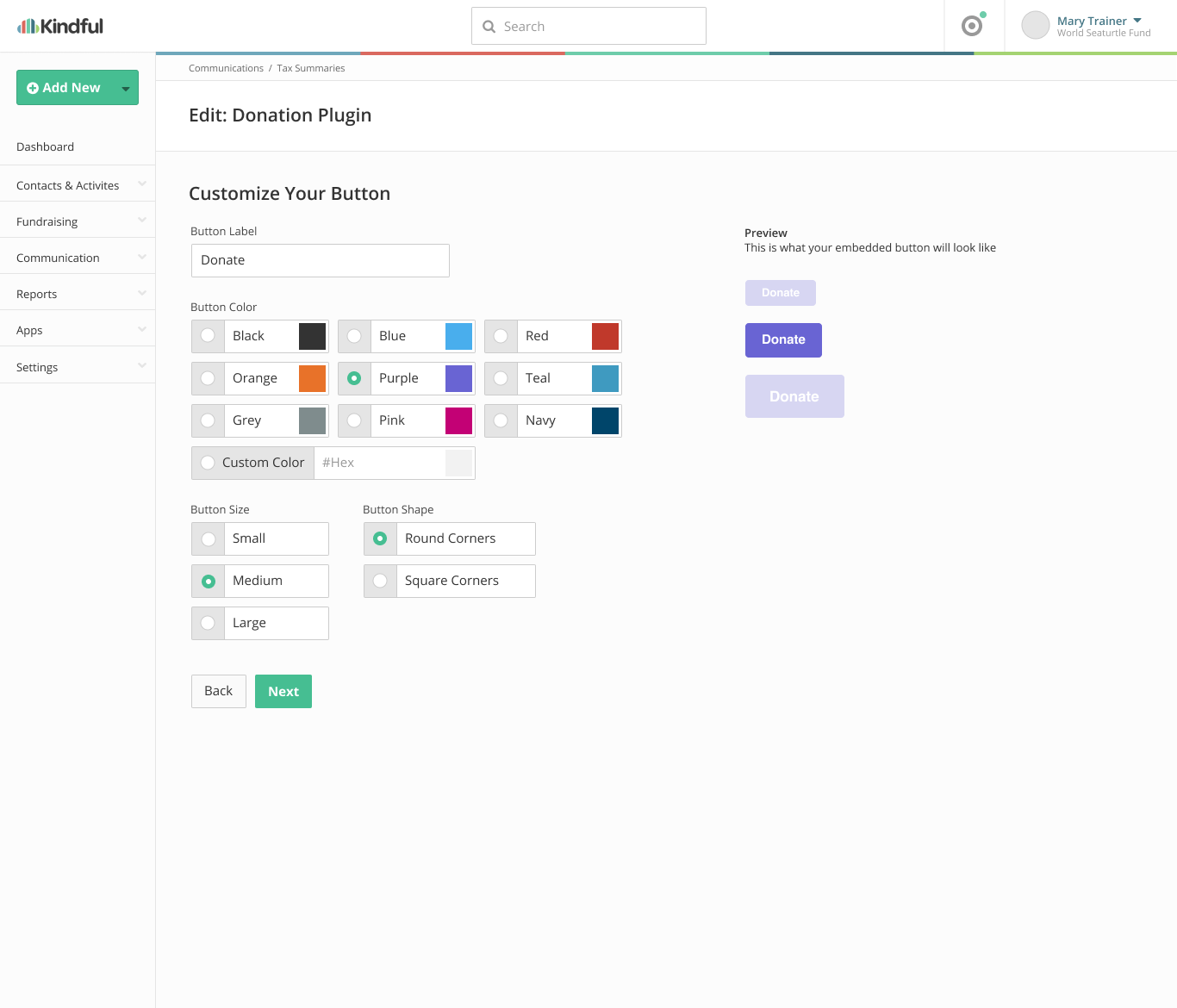
You can see the static page layout as well as the videos that were embedded on the page.
Feature page
In-Kind Gifts
Here’s the page layout. I crafted all copy and designed elements.
In-Kind Donation Tracking Feature Page
Feature page
Wealth Insights
Here’s the page layout. I crafted all copy and design elements.
Wealth Insights Feature Page
FEATURE PAGE
Fundraising Thermometer
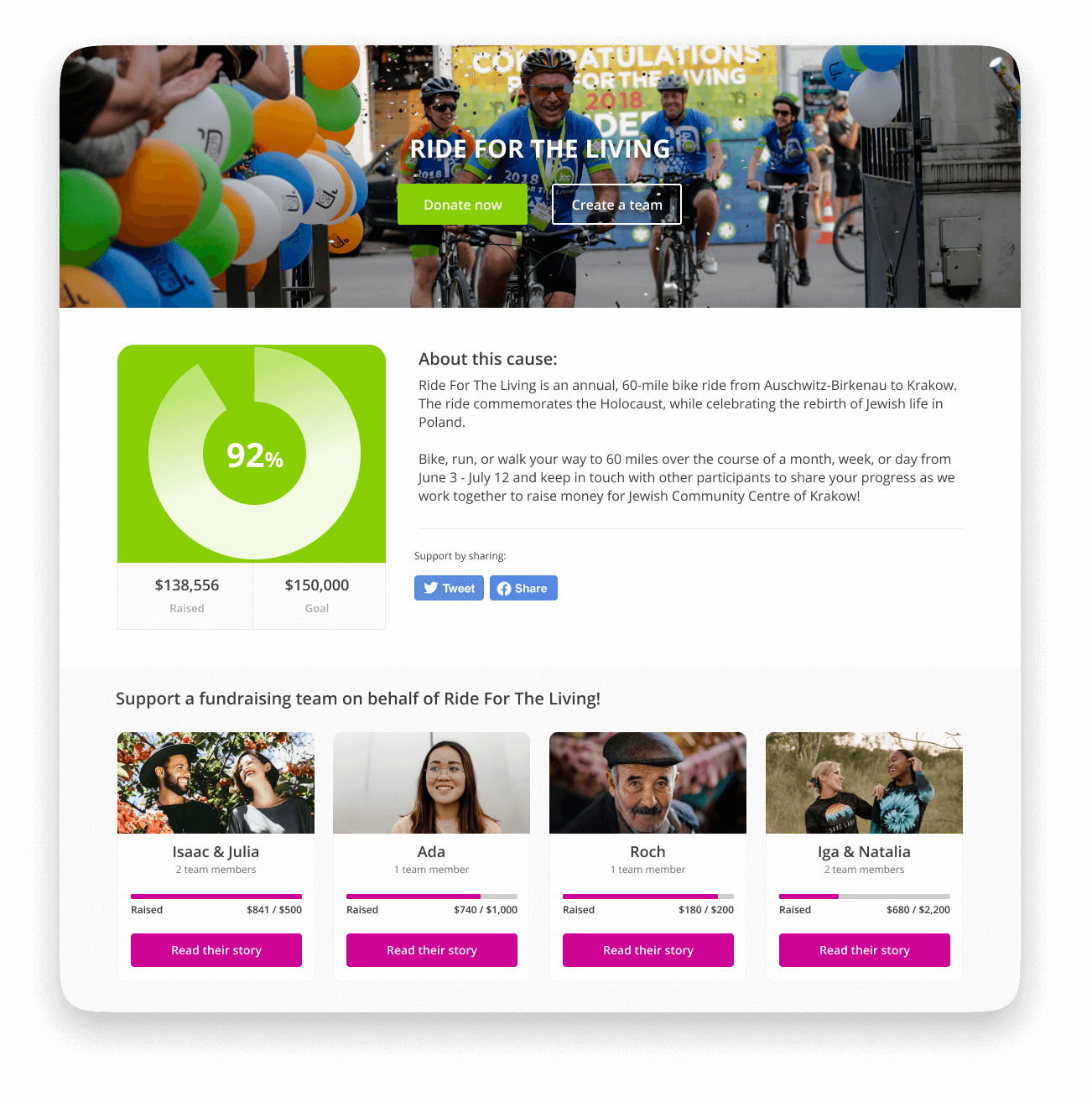
Here’s the page layout. I crafted all copy and design elements. The final image is a composite from a customer’s use of the API and embedding features.
Fundraising Thermometer Feature Page
More
I wrote copy for five other pages, but left the company before bringing them through the design process.

